Case Study: OFONO
Introduction
OFONO, a cutting-edge chat and messaging app, sought to revolutionize the way users express emotions digitally. As an app focused on enhancing communication through a more expressive language, OFONO required a sophisticated and intuitive user interface (UI) and user experience (UX) design that could seamlessly integrate their innovative features. Our creative and animation agency was tasked with designing a UI/UX that not only captured OFONO’s vision but also elevated the user experience to new heights.
Challenge
OFONO faced the challenge of differentiating itself in the highly competitive messaging app market. The primary goal was to create a unique, engaging, and easy-to-use interface that could appeal to a broad user base while incorporating advanced features like emotion-driven communication. The challenge was to ensure that these features were not only functional but also intuitive, so users could easily adopt and enjoy the app’s innovative approach to messaging.

Solution
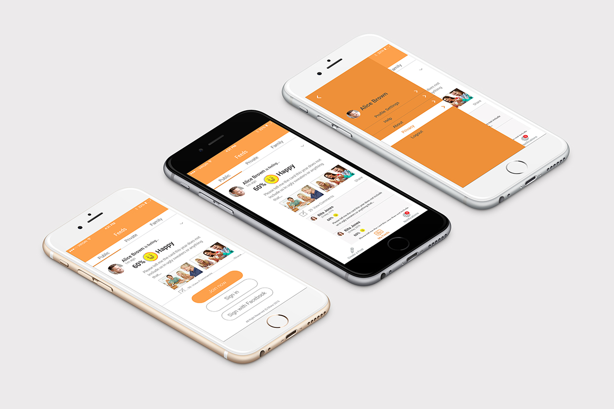
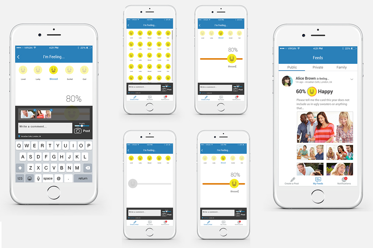
Our agency approached the challenge by first conducting extensive research on user behavior and preferences in messaging apps. We focused on understanding how users interact with emotion-based communication tools and what features they found most valuable. With these insights, we designed a sleek, modern UI that prioritized user engagement and ease of use. The UX design was centered around smooth navigation, quick access to expressive features, and a visually appealing interface that reflected the brand’s innovative ethos.
We implemented interactive animations and micro-interactions that brought the app’s emotion-driven communication to life, ensuring that users could easily convey their feelings through OFONO’s unique set of features. Additionally, we created a cohesive visual language that resonated with the brand’s identity, using colors, icons, and layouts that enhanced the overall user experience.


Results
The new UI/UX design significantly improved OFONO’s user engagement and retention rates. The intuitive design and smooth navigation led to a 35% increase in daily active users within the first three months of launch. User feedback highlighted the app’s ease of use and the enjoyment derived from the enhanced emotional expression features. Additionally, OFONO saw a 40% increase in positive app store reviews, with many users praising the innovative and user-friendly design.

Testimonial
“We were thoroughly impressed by the creativity and precision that went into the UI/UX design of OFONO. The team truly understood our vision and transformed it into a seamless, engaging user experience. The design has set us apart in the competitive messaging app market, and our users love it! We couldn’t be happier with the results.
Conclusion
The success of the UI/UX design project for OFONO not only enhanced their brand’s presence in the market but also set a new standard for emotion-driven communication in messaging apps. Our ongoing relationship with OFONO continues to evolve as we explore new opportunities to innovate and improve the app’s features. This project exemplifies our commitment to delivering top-tier creative and animation services that drive real results for our clients.
